


Data insights can help business users to make better, more informed decisions through the analysis and interpretation of data in a way that is visually engaging. With the help of progressive technologies and capabilities such as Business Intelligence (BI) and modern data warehousing, it has become much easier to consolidate and analyse data to expose its valuable patterns and trends.
To maximise the benefit of your data insights, we have set out some key tips for increasing their impact throughout the planning, delivery, and development stages of your data analysis.
Read next: Building efficient and scalable data platforms in AWS
Tip 1: Understand your user, their needs, and their priorities
To begin, it is important to understand your user requirements. Consider who will be reading your reports and why they need them before you start your work. A useful starting point is to gather a list of stakeholders, end users, and decision makers, then run discovery meetings to clarify their needs. These meetings could cover:
Any existing reports that are currently being used and any existing improvement ideas;
The reason for wanting additional insight, and which hypotheses or problems they can solve;
The desired user experience - including types of devices - that will ensure that the insight is of use;
Frequency of use and the types of communities that will be involved;
The actions that are likely be taken based on the insights, and how these will tie in to business outcomes and performance measures.
Tip 2: Know your tools of choice
There is now a plethora of high-quality data analytics and visualisation tools available on the market; each having their own strengths and weaknesses. When selecting your tools, you should consider the following:
The data sources you will need to connect to and whether your tool has the integration mechanisms, data extraction features, and appropriate performance and security functionality to ensure that you can use them effectively;
The availability of visualisations, appropriate for both use case and data source;
The development lifecycle, supported by the tool and lead times to deploy, as well as general ease of development, end user legibility, and ability to performance optimise and scale with data;
Business preferences around tooling, budgets, and technology ecosystems;
Built-in analytical capabilities, such as complex data modelling, trend analysis, statistical features, and semantic definitions;
Sharing, distribution, and collaboration features.
Modern agile delivery patterns, increasingly empowered end users, and ‘freemium’ SaaS tooling offerings allow you to trial a large number of technologies with end users and discover the best fit. As such, you will discover that there is less reason for significant costs up front.
Tip 3: Start small and expand as you go
Consider how you will be delivering your insights:
Be agile and deliver iteratively in order to maximise relevance and, in turn, value;
Build small and collaboratively with your end users and use frequent iterations;
Establish an ‘ongoing project’ mindset through strong product ownership and a continuous improvement ethos;
Focus on valuable, early outcomes to rapidly gain buy-in from end users;
Get continuous feedback on additional features and alternative techniques.
Tip 4: Choose your words and visuals carefully
Half of insight delivery is in your own interpretation. In order to help your audience to process the information correctly, be mindful about the visuals that you use to deliver your message. Consider what it is that you want to communicate to your audience with your data, and choose the visualisation that presents your message most effectively. Try to stick to one single message per visualisation.
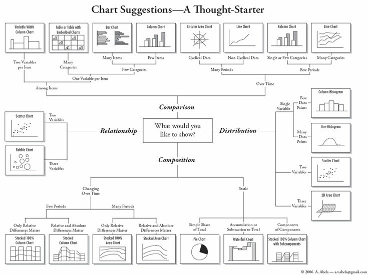
Whether you want to compare data, show composition, explore relationships, or understand distribution, a suitable selection of visuals will help you to convey your message easily whilst supporting user action. Dr. Andrew Abela has categorised visualisation techniques as follows:
Tip 5: Be selective in your use of colour
Colour is one of the most important things to consider when communicating complex data insights as it has a strong influence on how our brain processes information. Choosing your colours carefully will help your audience to interpret and understand your message much more easily. When selecting colours, consider the following:
Use consistent, complimentary colour palettes for your visualisations and insights;
Avoid the use of too much saturation or obvious contrasts – keep it clear but subtle;
Use gradients for continuous data points and distinctive colours for categorical ones;
Avoid the use of too many total colours, and limit them by using tables or KPI boxes.
Tip 6: Add labels and call out to draw attention
Your visualisation should clearly show patterns in your data without confusing your audience. Consider using clear labels, descriptive chart titles, and annotations. You should also pay attention to the language that you use in your labels and chart descriptions as this will help your audience to make sense of any business terms.
Tip 7: Less is more
While data itself may be complex, data insight is about telling a story that is clear, concise, elegant, and simple to connect with. Focus on communicating through your data, making information accessible to your audience and evoking interest in the overall story.
In order to achieve this, you should highlight any key information in your visualisations and avoid overwhelming your audience with clutter. Too many visual elements, uncomplimentary colours, poor choice of scales and axis, and special effects will distract users and obscure the message.
Focus on using minimalist designs whilst only highlighting key information. White space, soft greys, and ‘content as chrome’ are all visually appealing ways to achieve greater clarity. Avoid too many decimal places, unnecessary titles and axis, and avoid communicating more than one message on a single chart.
In a nutshell
With an ever-increasing number of visualisation tools available today, creating data insights has never been so easy. However, it is important to remember that not all visualisations will be as easily interpreted by audiences as you might expect. Data visualisation is both an art and a science and finding the right balance between the two is key. Following the tips highlighted in this article will help you to on your journey to delivering better data insights.
If you would like to find out more on this topic, please get in touch with one of our experts.
Contact Us
Ready to achieve your vision? We're here to help.
We'd love to start a conversation. Fill out the form and we'll connect you with the right person.
Searching for a new career?
View job openings